

Ask any finance team why their board report looks the way it does.
Most can’t tell you.
The chart type. The color of a variance bar. The decision to show twelve months or three. None of it was deliberate. It was inherited from whoever built the template before them.
Finance has been presenting data for decades without a methodology.
That is the problem worth solving.
Because how you present a number changes what people do with it. A chart that buries the variance forces the board to work. A chart that leads with the conclusion lets them decide. A report built for analysts looks nothing like one built for a CEO.
Three thinkers spent their careers solving this. Their frameworks are used by the world’s best finance teams. Until AI arrived, implementing any of them required weeks of training and tools that cost thousands per seat.
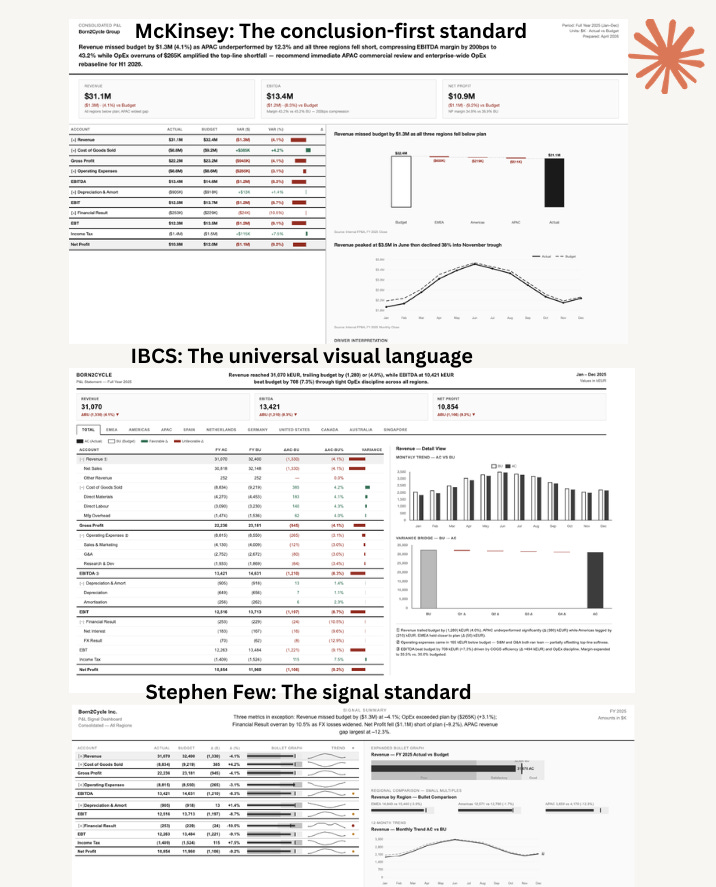
IBCS certification courses run five days. McKinsey’s Pyramid Principle takes months of practice under real board pressure. Stephen Few’s books are taught in graduate programs.
Finance teams that wanted to report at this level had two options. Hire someone who already knew how. Or invest in the training and tools to build the capability from scratch.
Most did neither. They kept the inherited template.
Claude changes the equation.
You do not need a certification. You do not need a licensed tool. You need a skill file that encodes the rules, a CSV with your financial data, and fifteen minutes.
Here is how to build all three and master financial storytelling.
The Three Storytelling Frameworks
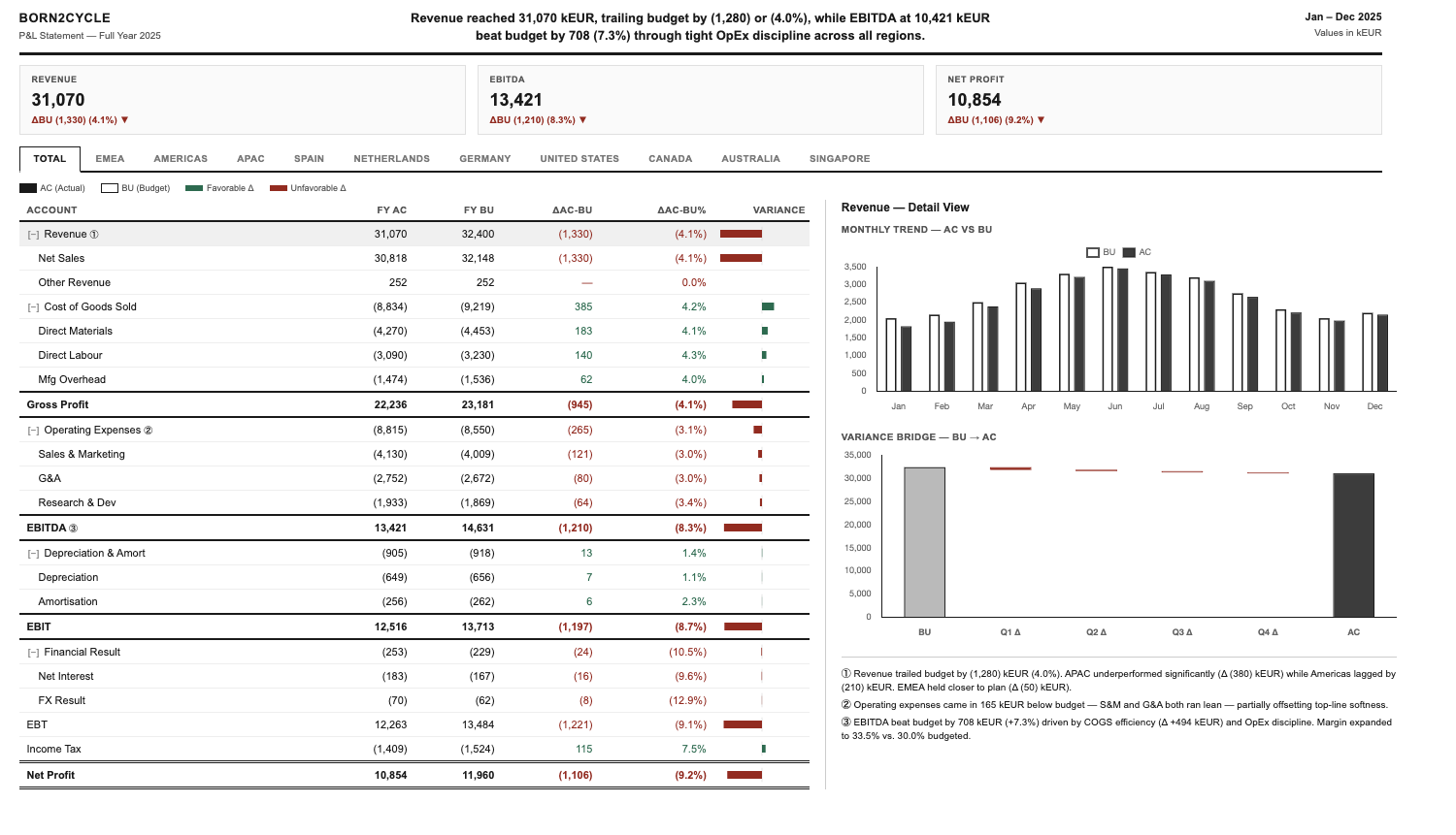
IBCS: The universal visual language
In 2004, Rolf Hichert published the International Business Communication Standards. His argument: every finance team uses different visual conventions. A solid bar means actual in one report and forecast in another. Every reader decodes every report from scratch.
IBCS fixes this with one rule: same notation, always. Actual is always solid black. Budget is always hollow. Positive variance is always the same green. Negative always the same red.
Once your company learns the language, they stop reading the legend and start reading the performance.
Before AI: a five-day certification course. Licensed BI software. Thousands per seat.
McKinsey: The conclusion-first standard
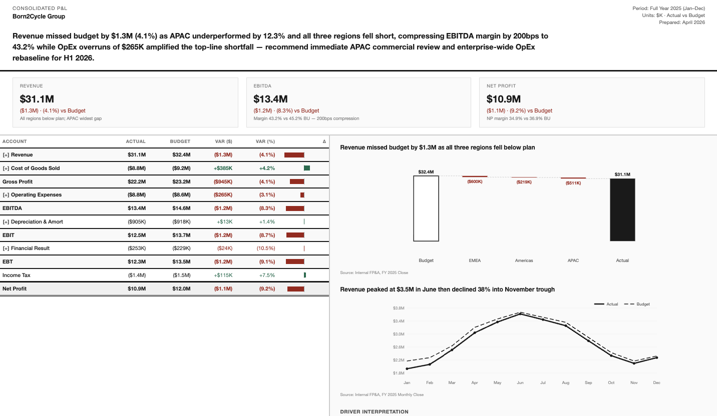
In 1987, Barbara Minto published The Pyramid Principle. The most influential book on business communication ever written.
The rule: lead with the so-what. Every chart has an action headline that states what the data means. Not “Revenue by Month.” Instead: “Revenue recovered in H2, offsetting a soft Q1 driven by delayed launches.” The board does not interpret. They decide.
Before AI: months of practice under real board pressure. A skill you hired for or built slowly.
See the live McKinsey report here.
Stephen Few: The signal standard
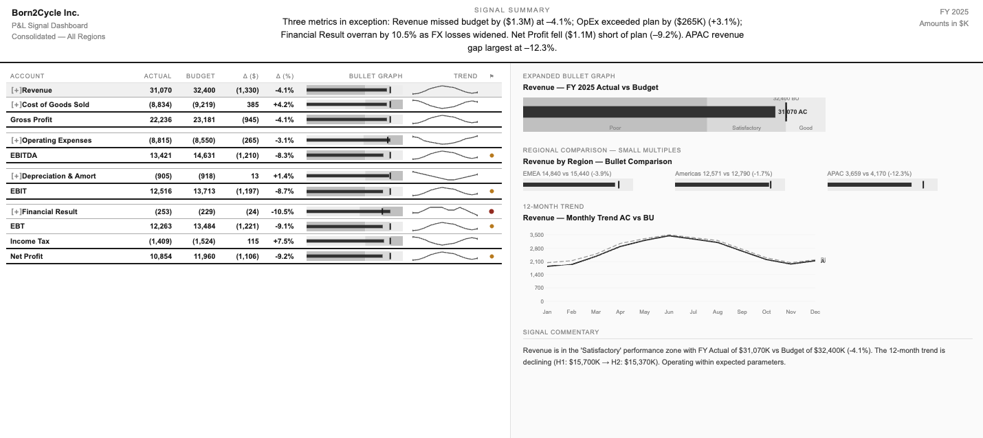
Stephen Few studied how humans perceive visual information across three books. His principle: maximize the data-ink ratio.
Every pixel that does not carry information is waste. Bullet graphs instead of gauges. Sparklines inside every table row. A single red dot for exceptions. Nothing else.
The result: a trained analyst reads the entire report in seconds.
Before AI: graduate-level coursework. Years of deliberate practice.
See the live Stephen Few report here.
How to master financial storytelling with Claude
Step 1: Goto Claude.ai
Goto Claude web client and upload skills. Click manage skills.
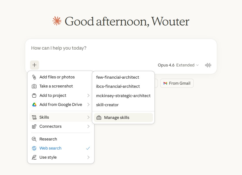
Upload these 3 skills:
