

For 30 years, finance teams had a legitimate excuse.
The data was in one system. The story was in another. Turning numbers into something a board could actually read took hours of manual work, a designer, a BI tool, or all three.
That excuse is gone.
I uploaded a CSV file to Claude. 3,000 rows of financial data. Actual vs budget. Multi-level account hierarchy. Multi-level entity hierarchy. Monthly trends.
One prompt. One skill file.
What came back looked like a CFO built it.
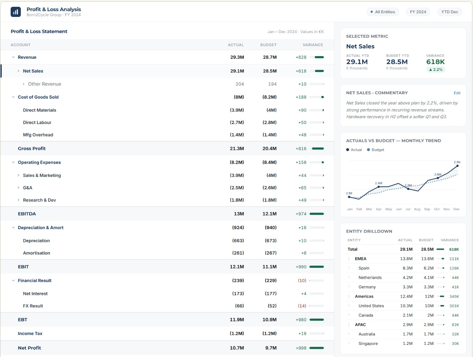
A fully interactive Profit and Loss report. Hierarchical rows you can expand and collapse. Click any line item and the right panel updates instantly. Trend chart. Entity breakdown. Variance direction. The full story behind every number, one click away.
No code written manually. No designer. No BI tool subscription.
This is what financial storytelling looks like when the excuse runs out.
Why finance has always struggled to tell its story
The numbers were never the problem.
Every CFO has the data. Most finance teams produce accurate reports. The problem was always the gap between accurate and clear. Between a spreadsheet full of correct numbers and a story that makes a board understand what happened and what to do next.
That gap existed because building something visual and interactive required skills most finance teams do not have. Design. Development. BI configuration. Every tool that promised to close the gap added complexity instead.
So finance defaulted to what it knew. Flat Excel tables. PowerPoint slides rebuilt from scratch every month. Commentary written by hand in boxes that nobody formatted the same way twice.
The story was always there. It just never had a home.
How to visualize a P&L with Claude and build a CFO report
Go to claude.ai
COPY/PASTE PROMPT